Alternatives to Hamburger Menu


The hamburger menu has been a hot topic among designers for years. While many apps still rely on this pattern, it often stems from poor information architecture or an overwhelming amount of content. This approach can hide complexity but comes at a cost—reducing engagement, slowing exploration, and confusing users.
If your app is growing too complex, it might be time to rethink your navigation strategy or considering breaking up functionality in their own separate apps (like Facebook and Messager)
Let’s explore some user-friendly alternatives to the traditional hamburger menu:
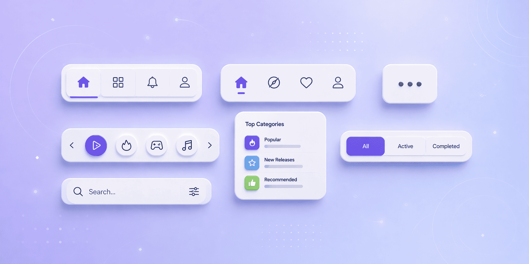
Tabs organize content into clear, recognizable categories. Their simplicity, especially when paired with icons and labels, makes them a go-to choice for intuitive navigation. Tabs excel in keeping users oriented and engaged without overwhelming them.

Ideal for a handful of primary options, bottom navigation ensures key actions remain visible at all times. This pattern is particularly useful for apps with equally important sections. To save vertical space, consider hiding the navigation bar when users scroll and revealing it when they scroll up. Icons with labels are recommended but not mandatory if the icons are self-explanatory.

For apps with numerous options, a “Show More” feature can declutter the interface. This option can open a modal, pop-up, or new page, maintaining a streamlined screen while giving users access to additional features.

When your app has more options than the screen can display, scrollable navigation is a great solution. This is commonly used with tabs, as seen in apps like Netflix or the Play Store, allowing users to browse multiple categories without visual overload.

For web or hybrid apps, inline navigation lets you organize top categories on the main hub or homepage. Present these groups as a list with distinct headers, and use horizontally scrollable cards beneath each category for easy access to content.

When you only have a couple of destinations, segmented controls are an excellent option. All choices are visible and accessible with a single tap, keeping navigation straightforward and user-friendly.

Search is often buried behind the hamburger menu, but if it’s a critical feature, it should be front and center. Place the search bar at the top of the screen or include a visible icon that leads directly to search mode.

Studies show that apps relying on hamburger menus see lower engagement and time spent in-app. Companies that thrive on keeping users engaged have moved to more obvious, intuitive patterns.
If you need to convince a client or manager to rethink the hamburger menu, remind them that navigation shouldn’t be a “junk drawer” for everything without a proper home. Thoughtful, clear navigation is always the better choice.
Obvious and user-friendly navigation will always outperform hidden complexity. Challenge the status quo, and consider these alternatives to improve your app’s usability and engagement.
Subscribe to our newsletter to get the latest news and updates!