


Jan 29, 2025
Pop-Up Dialogs: The Nerdy Guide to Doing Them Right
Let’s dive into the nerdy details of pop-up dialogs—when to use them, how to keep them snappy and clear, and making sure they help users instead of annoying them.
Dialogs are like the power-ups of the UI world, when done right, they help users smash through tasks faster and smoother. But let’s be real, when done wrong, they’re the boss fight no one signed up for. Designing great dialogs is a quest worth embarking on, it’s all about creating a balance between functionality and keeping users happy.
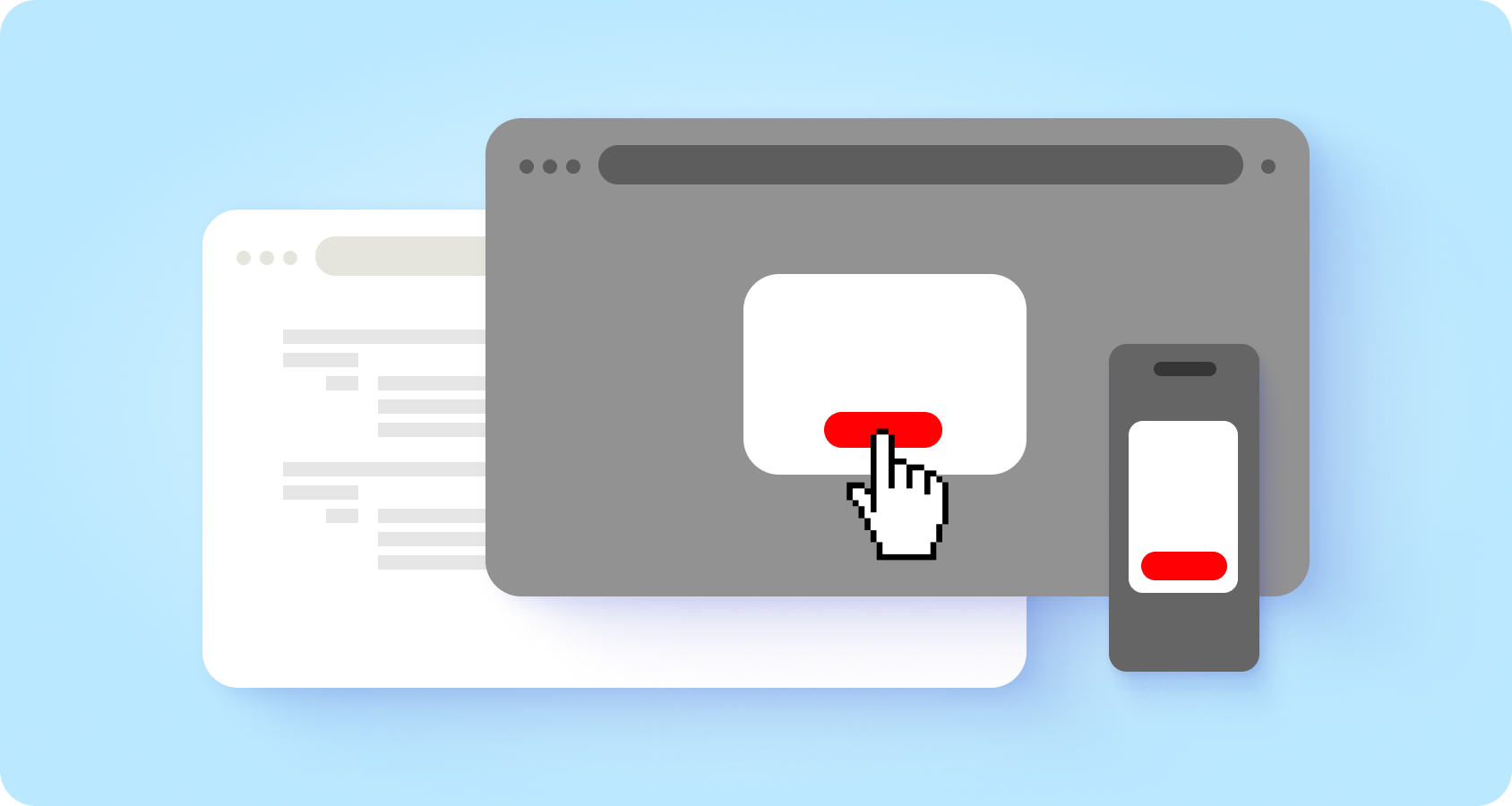
A pop-up is an overlay that demands your attention, asking you to interact before continuing. Whether it’s asking users to confirm a decision, sharing critical info, or guiding them through multiple tasks, dialogs are your UI’s way of saying, “Hey, this is important!” They’re popping up everywhere—in apps, on websites, and even mobile—focusing attention without dragging users away from their current screen.
Classic Example: That session expiration warning dialog? A lifesaver when done well. A frustration fest when it’s not.

Don’t overuse dialogs, they can be pretty disruptive. They interrupt whatever the user is doing and demand attention. Users have to deal with the dialog before they can get back to where they were, which can be helpful for big decisions like confirming “Do you want to delete your account?” But for most tasks, they’re not needed and can get really annoying.
Pop-ups = interruptions. Use them sparingly! They force users to pause their current task, which can be helpful for high-stakes decisions (like confirming a deleted) but super annoying if overused.

Never let pop-ups appear not out of nowhere. They should be like polite waiters—showing up only when called (via button clicks, links, or other user actions). Surprise pop-ups? Big no-no.

Pro Tip: Always tie a dialog to a user action, like clicking a button or link. Surprise dialogs are the villains of UX.
Dialogs should feel like a helpful friend, not a confusing tech manual. Use language that’s clear, direct, and human.
Use plain, user-friendly language that matches your audience. Avoid cryptic system terms. For example, don’t say, “Free your storage?” when you mean, “Delete your files?” Be specific, like, “Do you want to delete these 5 files?”

In most cases, users should understand the choices just by a title and a button text alone.
Skip the ambiguity and visual clutter of vague warnings like “Are you sure?” Instead, make options crystal clear. For example:

When a process is completed, remember to provide a message or visual feedback to the user. If users need additional details to make a choice, don’t hide them in expandable sections. Instead, rethink if a pop-up is the right solution.

Dialogs are meant to be quick helpers, not mini webpages. Stay focused and avoid overloading them. A clean, simple design works across desktops and mobile screens. Bonus: no scrolling required!
Two is company; three is a crowd. Stick to two clear actions, like “Save” and “Cancel.” Adding extra options like “Learn More” often leads users down a rabbit hole of unfinished tasks.

If your interaction needs multiple steps, it’s better suited for a full page, not a pop-up. Complex processes deserve breathing room.

You should use modals for example for critical and important interactions (delete, terms & conditions, etc).
Dialogs come in two flavors—modal (must act before continuing) and non-modal (click outside to dismiss). Each has its place.
Use these for serious stuff, like deleting accounts or agreeing to terms. Modal dialogs keep users focused.

For quick, optional actions, non-modal dialogs are the way to go. Bonus points for allowing users to tap outside to close.

Design matters, even for a dialog box. Keep it easy on the eyes and intuitive for users
One cool thing about pop-ups is that they let users stay aware of their current screen. But darken the background gently, so the dialog stands out like a spotlight on the stage.

Make it easy for users to exit:

Avoid launching a chain of pop-ups (pop-upception!). It’s confusing and frustrating in any scenario.

Good pop-ups = happy users. Bad pop-ups = uninstall city. So, mock up your dialogs, test them with real people, and remember: UX is about humans, not just flashy interfaces.
Now go forth and build pop-ups that shine! ✨


