Building beautiful, high-performance Human-Machine Interfaces (HMIs) across multiple platforms can be challenging—but Avalonia makes it easier, and UXDivers is fully embracing this game-changing framework.
In this article, I’m excited to share the journey of adding multi-theme support to an existing Avalonia UI application. But first, let me set the stage with a little background about the app.
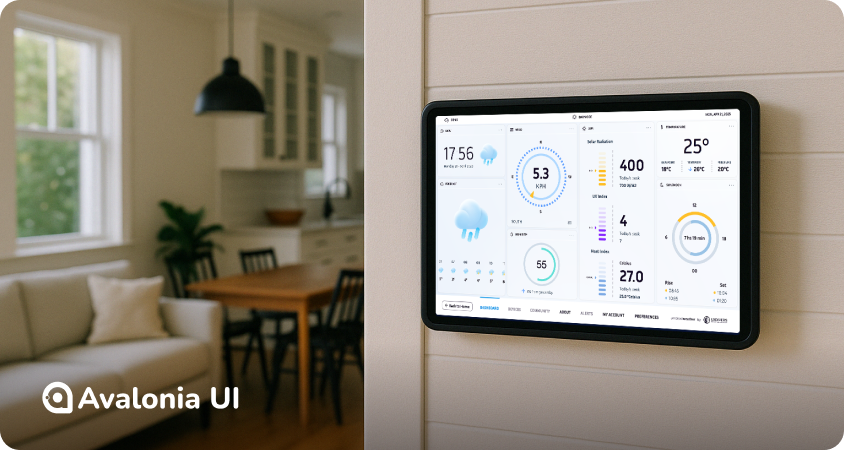
In 2023 .NET Conf, UXDivers unveiled a Weather App that connects to Ambient Weather stations to display real-time weather data. It also integrates forecasting capabilities powered by Meteomatics services. The app was designed and built to work reliably across platforms and was thoroughly tested on a Raspberry Pi running Linux.
Today, we’ll dive into the experience of adding a Light theme to this already stunning UI, all thanks to the flexibility and capabilities of Avalonia UI. Spoiler alert: the journey was nothing short of delightful! 😎
We’ll begin by exploring the theme organization and the powerful features Avalonia offers to support it. After that, I’ll share some of the technical challenges with solutions encountered along the way, and how we tackled them.
Theming
Avalonia has the concept of Theme Variants, that allow changing the look and feel of the entire application or part of it using scopes (I’ll leave scopes out for this article since we were focused on app-level changes)
What makes Theme Variants so great is how easily you can define themes directly in XAML using the ResourceDictionary.ThemeDictionaries property. Even better, you can switch themes at runtime simply by updating the application’s RequestedThemeVariant property. Compared to platforms where resource swapping is a manual (and often tedious) process, this is a game-changer! In Avalonia, switching themes was an absolute breeze—both incredibly simple and impressively fast.
Here’s how we set up the Dark and Light theme resources in our App.axaml file using the ThemeDictionaries property:
As you can see, we’ve included separate Light and Dark files, each containing the full color palette for their respective themes. To keep things clear and organized, we chose to prefix every resource in these files with the word "Theme". This makes it immediately obvious when a resource is coming directly from the theme, helping avoid any confusion down the line.
Here’s a simplified version of the final resources structure:
App.axaml includes
Light.axaml (included as ThemeDictionary)
Dark.axaml (included as ThemeDictionary)
Resources.axaml (included as a MergedDictionary)
In Resources.axaml, we use the colors defined in the theme files to create the brushes and styles for the app. The key thing to keep in mind is that resources from the theme dictionaries must be referenced as DynamicResources. This ensures that the app can respond to theme changes at runtime without any issues.
Theme Switching
To make the option of swapping between dark and light modes available everywhere, we added a toggle button on the StatusBar at the top. That button goes against the new ThemeStore, which has a command that simply swaps the app’s theme.
[ObservableObject] public partial class ThemeStore : DisposableObject { [RelayCommand] private void ToggleTheme() { var currentVariant = Application.Current!.ActualThemeVariant; Application.Current!.RequestedThemeVariant = currentVariant == ThemeVariant.Dark ? ThemeVariant.Light : ThemeVariant.Dark; OnPropertyChanged(nameof(CurrentTheme)); } public ThemeVariant CurrentTheme => Application.Current!.ActualThemeVariant; }
SVGs
The app uses several SVGs to display scalable icons and logos, leveraging the excellent Avalonia.Svg.Skia package. This worked flawlessly when we had just one set of colors, as we could simply embed the required colors directly in the SVG code.
However, introducing multiple color variants brought a new challenge: how to dynamically update the colors. Thankfully, we discovered that the package had recently added support for passing CSS code to customize the look and feel of SVGs!
To streamline this process, we created a custom control called ColoredSvg, which extends the base control provided by the library. This new control includes a stylable Fill property. Whenever the Fill property changes, we dynamically update the SVG's fill colors using CSS. It was a straightforward solution that worked like a charm.
The main dashboard relies on LiveCharts to render two key widgets: Humidity and Sun/Moon.
Both widgets use Gauges, which we generate using a custom GaugeGenerator class. This class provides helper methods to create charts by passing the relevant items' information. Initially, we hardcoded the dark theme colors into these items at creation time. However, with the introduction of dynamic themes, these colors needed to update whenever the theme changed.
Once again, Avalonia's stylable properties came to the rescue. We added a few styled properties for colors to the widget components. When these property values changed, we refreshed the chart display. Here's how the widgets are configured now, with properties pointing to the specific theme colors:
This app was originally designed with touch screens in mind, but for this version, we’ve enhanced its cross-platform interaction capabilities. One notable improvement is the addition of a behavior that converts vertical mouse wheel events into horizontal scrolling for ScrollViews.
This feature is especially useful for devices without a touchpad or any other input mechanism that supports horizontal movement. It ensures a smoother and more intuitive navigation experience across different platforms and input setups.
Nuget Updates
We upgraded from Avalonia UI 11.0.10 to 11.2.5, as well as updating every other package to their latest versions.
Conclusions
Theme support in Avalonia is truly impressive. Thanks to Theme Variants as a core platform concept, enabling runtime theme switching required almost no additional code at the application level—a huge win for simplicity and maintainability.
As for the other challenges we encountered, they were met with elegant solutions that kept the development process smooth. Overall, we’re thrilled with the results, particularly in terms of code structure, runtime performance, and ease of development.
I hope this article gives you valuable insights! If you’re interested, you can request access to the code. We’d love to hear your thoughts and experiences!


