29 September, 2025
Infinite Scroll vs Pagination: How to Choose
A practical breakdown of list patterns. Decide when to scroll, load in chunks, or page with clear rules, quick checks, and tips that keep speed, accessibility, and SEO on track.
Lists power so many products, feeds, search results, catalogs. Sooner or later you’ll face the classic decision: infinite scroll vs pagination, or the middle path, Load More. There isn’t one true answer. The right choice depends on user intent and what you want the screen to achieve. Let’s make the decision simple.
People use lists in two very different moods.
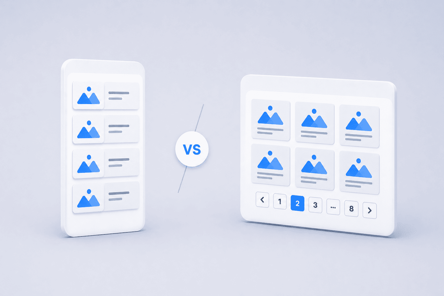
Curiosity rules here. Less friction means more discovery, and infinite scrolling keeps the momentum. It shines when your goal is exposure and time-on-experience, not precise refinding.
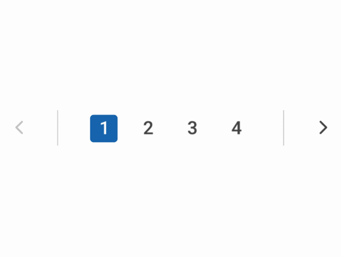
Find the right size. Compare specs. Jump back to that thing you saw. Here users need orientation, deep linking, and a clean way to return to spot. That’s where pagination UX excels. Load More can also work when you want speed and control on the same screen.
Perfect for discovery. It keeps momentum and reveals more content with less effort. If you choose it, make it resilient:

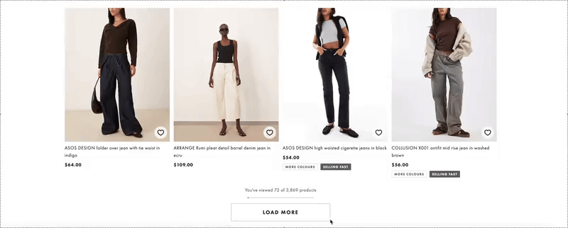
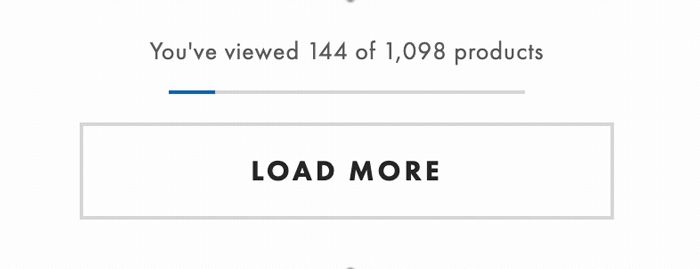
The middle path. A quick click adds a chunk, the layout remains stable, and users feel in control.
Structure first. Best for search, ecommerce, admin tables, and documentation.
Good list UIs keep your place and work smoothly with keyboards and screen readers. Use clear landmarks, label pagination controls, and announce new results politely. Keep it fast by virtualizing long lists, lazy loading media, and recycling offscreen content. Most important, restore position when people go from detail to back.
Ask five questions:
Answer those, and the choice is rarely controversial.
When you ship, look beyond scroll depth. For exploratory feeds, track how often people save, share, or follow something new. For shopping and search, track how quickly they refine filters, how often they add to cart, and whether they can find an item again after a detour. Run a quick usability test that forces a return-and-refind moment. You’ll learn more from that than from any “time on page” metric.
Trends come and go. Your users do not. Choose the pattern that fits their intent, keep performance and accessibility tight, and make sure search can follow along. If you are also unsure about best practices for adding navigation to your app, this post can help with your decision.